
Stats for City of Ottawa, ON, Canada
|
COVID-19 &
Respiratory Virus - Weekly Stats for City of Ottawa, ON, Canada |
This page contains data from the Ottawa COVID-19 Dashboard and graphs tracking the latest wastewater levels for COVID-19, RSV, Influenza A&B, deaths, number hospitalized for COVID, current ICU admissions, PCR testing/positivity, and vaccine coverage in the city of Ottawa, Ontario, Canada. Graphs for current variants circulating in the province of Ontario are also available. For now the graphs are updated on a weekly basis on the weekend. Historic data has been archived and available on a separate page linked below.
You can also find COVID-19 Articles and Calculators and COVID-19 Weekly Stats for Ontario, Canada and Historical Data of Ottawa, ON and Historical Data of Ontario, Canada, and Global and Measles Stats for Ontario, Canada.
Table of Contents
1. Wastewater (COVID, RSV, Flu)
2. Hospitalizations (COVID, RSV, Flu)
3. Hospitalization Rate by Age (COVID)
4. Case Rate by Age (COVID)
5. Virus Testing Results
6. Respiratory Related ED Visits
7. Outbreaks in Healthcare Institutions
8. Hospital Bed Occupancy
9. Variants (Ontario)
10. Ottawa Vaccine Coverage
11. Historical Data of
Ottawa (2020-2024)
Ottawa Wastewater 7-day Rolling Average
The following graph shows the recent COVID-19 wastewater 7-day rolling average as a blue line, including horizontal dotted lines in red for the maximum level since Sept. 2020, in orange for the average wastewater level since Sept. 2020, and in yellow for the average level since Sept. 2025. The vertical dotted lines show which variants became dominant at the time of the line.
The graphs below show the 7-day rolling average of COVID-19, RSV, Influenza A, Influenza B, and MPOX viral signal in wastewater which provides a city-wide view of viral activity to help determine if the number of infected people in Ottawa is increasing, decreasing, or staying the same. The specific number of normalized viral copies for each different virus should not be directly compared to each other. You can access the raw data on GitHub.
Ottawa Hospitalizations (COVID, Flu, RSV)
Ottawa Public Health (OPH) is now providing new hospitalizations in Ottawa due to COVID-19, Influenza or RSV which the data is available from the Public Health Ontario respiratory virus tool in the Outcomes section.
Comparing previous years, new hospitalizations due to COVID have greatly decreased while Influenza is making a comeback.
This graph shows a different view making it easier to see the breakdown of hospitalizations between COVID-19, Influenza, and RSV as a percentage of patients between just those three viruses. As you can clearly see, COVID-19 causes the majority of hospitalizations between those 3 viruses throughout the year.
If you plot each of the new hospitalizations *due to* COVID-19, Influenza, and RSV virus as a line graph you can see throughout the year even when COVID-19 hospitalizations are at their lowest they usually remain above the levels of the other two and often significantly higher than both combined.
Ottawa Hospitalization Rate by Age (COVID)
This graph shows the breakdown of hospital admissions for COVID per 100k population by age group. The age range definitions changed in September 2025 so we have limited data so far. Look further below for more historical data going back to Oct. 2021.
This second graph provides a different view stacking to 100% the # of patients per 100k population by age so you can see the proportion each week.
The following chart shows the COVID-19 hospital admission rate per 100k population by age group in Ottawa from Sep 2025 to Present when they changed the age group definitions. While the rates of hospitalization from COVID have decreased since the start of the pandemic, the proportion of young children being hospitalized compared to older adults has increased a lot where the rates of age 0-4 are higher than the rates of older adults 65-74 now.
This bar graph shows the breakdown of hospital admissions rate for COVID in Ottawa between children (0-17) and adults (18+) since 2022.
Ottawa used specific age groups from Oct 2021 to August 2025 which are shown in this graph of hospital admissions for COVID per 100k population As you can see while the 80+ age group had the highest rate of hospital admissions, the youngest children age 0-4 often bounced between second and third highest rate with adults age 60-79.
Looking at Hospital admissions for COVID by age group for the entire period of October 2021 to August 2025 combined, you can see that the age 5-39 hospitalization rates were very similar, age 40-59 increasing higher, and then age 0-4 had a massive jump in rate, followed by age 60-79 and then 80+ by far the highest rate. Whomever said that children are not seriously impacted by COVID didn't look at any actual data, age 0-4 was most definitely impacted more than most age groups and even older children were impacted a similar level to adults up to 39.
When you break down the hospitalization rates by year, you can see they have gone down each year since 2022 across the board. In both 2022 and 2023 the rates for kids 0-4 were almost as high as age 60-79.
Comparing this city to the province, the admission rate was almost twice as high for age 0-4, 5-11, and 12-17 in Ottawa vs Ontario. There was a much larger stepwise increase in rates going from age 5 to 39 in Ontario whereas Ottawa rates were pretty comparable. The age 40-79 age groups were similar between Ottawa and Ontario, and there was a much higher rate of older adults 80+ being hospitalized in Ontario than Ottawa. It seems older adults were better protected in Ottawa but the opposite for children.
Ottawa Cases Rate by Age
(COVID)
The graphs below shows the COVID-19 cases per 100k population by age group in Ottawa. For COVID-19, a positive PCR/NAAT result is counted as a case if separated in time by at least 90 days from a previous positive result. Testing is very limited so doesn't represent the general population like wastewater testing. Children would typically only get this kind of COVID test if they were at the hospital (e.g. ED visit, admission) so any reported child cases are likely more serious. Data from PHO.
The next set of charts illustrate the annual proportion of COVID-19 cases per 100,000 population in Ottawa across different age groups. The graph visualizes how the relative distribution of cases shifts over time among demographics ranging from infants to seniors aged 80 and older.
Ottawa Virus Testing Results
(PCR)
The graph below shows the 7-day rolling average of new COVID-19 PCR tests and the % of positive PCR tests that day. Data from OPH.
This next graph looks more broadly at other circulating viruses being tested displaying the test percent positivity each week for the current surveillance year. Data from PHO.
This graph provides a different view stacking to 100% the test positivity of circulating viruses for the current surveillance year so you can see the proportion each week. Data from PHO.
This following graph shows a range of circulating viruses being tested displaying the test percent positivity each week with a longer historical window since August 2022. Data from PHO.
This graph provides a different view stacking to 100% the test positivity of circulating viruses so you can see the proportion each week. Data from PHO.
This graph shows the Ottawa residents with lab confirmed influenza by age for the current surveillance year. Respiratory Surveillance Dashboard.
Our young children are the most vulnerable to respiratory infections. This graph tracks the total respiratory related ED (Emergency Department) visits per 100K population by week broken down by age groups in the city of Ottawa, ON, Canada. This includes other respiratory viruses in addition to COVID, Influenza, and RSV with the raw data available from OPH transformed into rate per 100K population using Census data from Statistics Canada.
This alternate view shows the % of respiratory related ED (Emergency Department) visits by week broken down by all age groups in the city of Ottawa, ON, Canada so you can more easily see the impact on each age group. The youngest 0-3 age group accounts for more than 50% of respiratory related ED visits per 100K population despite making up only 3.75% of the population and children <17 account for 75% of respiratory related ED visits per 100K population while making up 20% of the population.
The stacked column graphs show the # of respiratory related ED visits per 100K population by week and age in Ottawa.
Outbreaks in Healthcare Institutions
The graph below shows the monthly Ottawa COVID cases grouped by healthcare facility type over time. Retirement homes had the highest # of outbreak cases, followed by long term care homes. You can access the latest data from Ottawa Public Health.
This chart shows the COVID-19 cases from outbreaks in Ottawa by year split by Staff and Residents/Patients.
These graphs below show the Ottawa COVID hospital bed occupancy rate (per 100K population) grouped by age which presents the average daily occupancy count per week of people in hospital (including the ICU). You can access the latest data from Public Health Ontario.
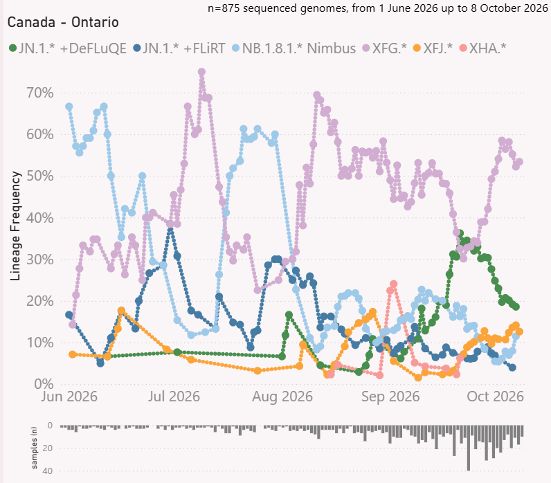
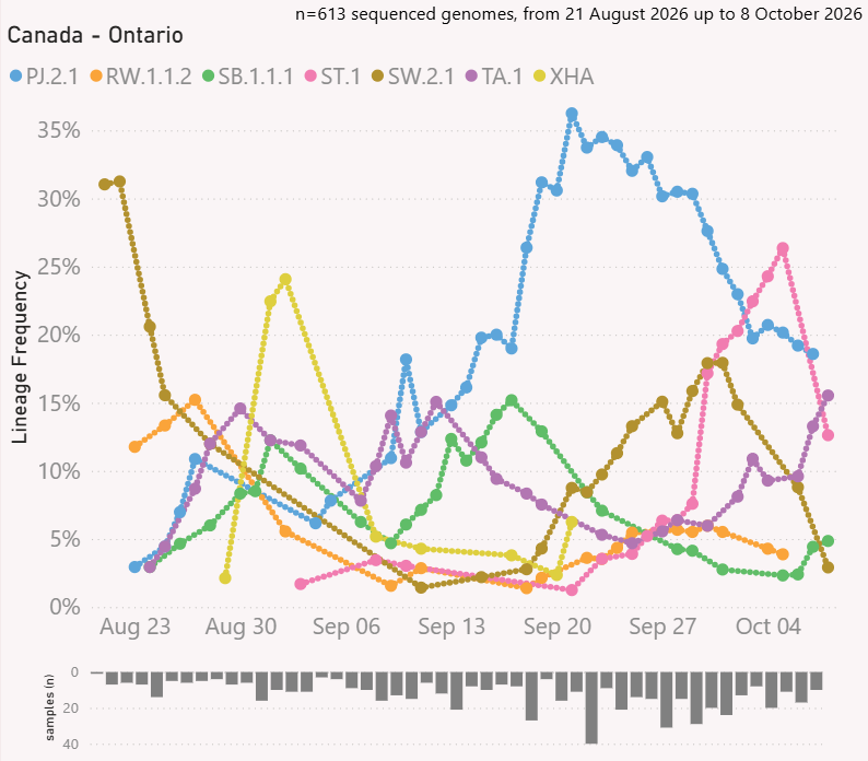
Variant genomic sequencing analysis uses data from gisaid.org with nextclade lineages and visualization by Mike Honey with source available on github. You can visualize variants in your own country or location by using this online visualization tool.
 |
 |
Vaccine Stats &
Coverage (Ottawa)
The information below shows the vaccine stats for the city of Ottawa, ON, Canada. Source of data comes from the Ottawa Vaccination Dashboard.
Since COVID vaccine antibody levels wane over time, especially after 4-6 months, and the virus continues to mutate and evade previously developed immunity, it is helpful to track what percentage of the population has been getting updated vaccine doses each year. The following charts show the population vaccination coverage since the fall COVID vaccine roll-out for the year.
|
 |